Leading a Team to Understand Social Behaviors
Background
Background
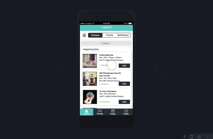
Linute is a startup in Queens whose focus is creating last-minute connections through user-curated event postings. Co-founders, Nabeel Alamgir and Andi Muskaj, took it upon themselves to solve a personal problem that many of their peers related to – finding things to do when plans fall through.
During our stakeholder meeting, the company, a team of 6 spanning marketing, engineering and business development roles, expressed interest in building out the onboarding process, gamifying the app and enticing users to create more events over the course of 3 weeks. Through research, my teammates, 2 fellow UX designers, and I found that users are hesitant about creating social events and redesigned their app to be simpler and intuitive to make the process of creating an event and finding new, relevant ones easier. TL;DR – skip to the prototype.
Company
Linute
Stakeholder
Founders + Development
Users
College students/event seekers
Challenges
• Build out the onboarding process
• Gamify the app to entice users to create more events
Responsibilities
Lead UX/UI, IxD
Length
~3 weeks
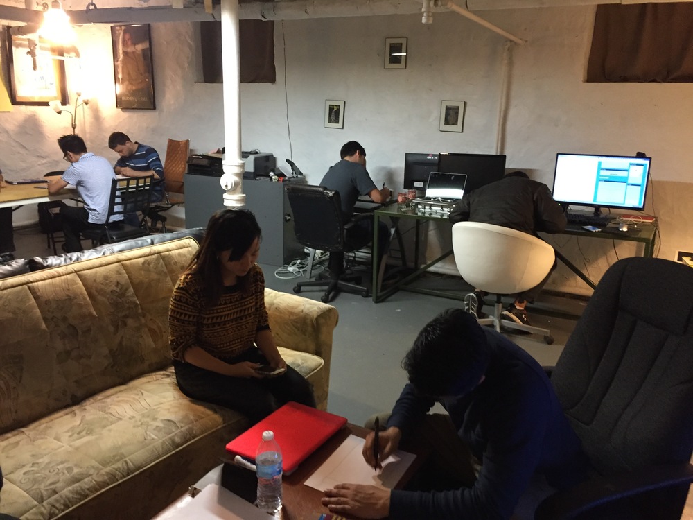
Research
Research
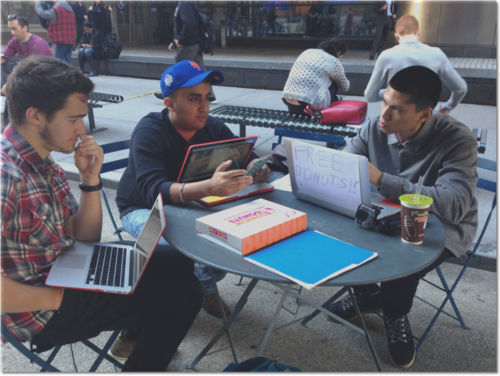
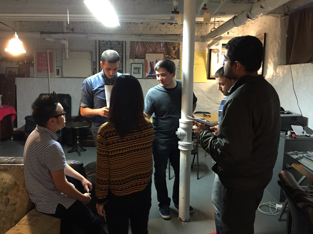
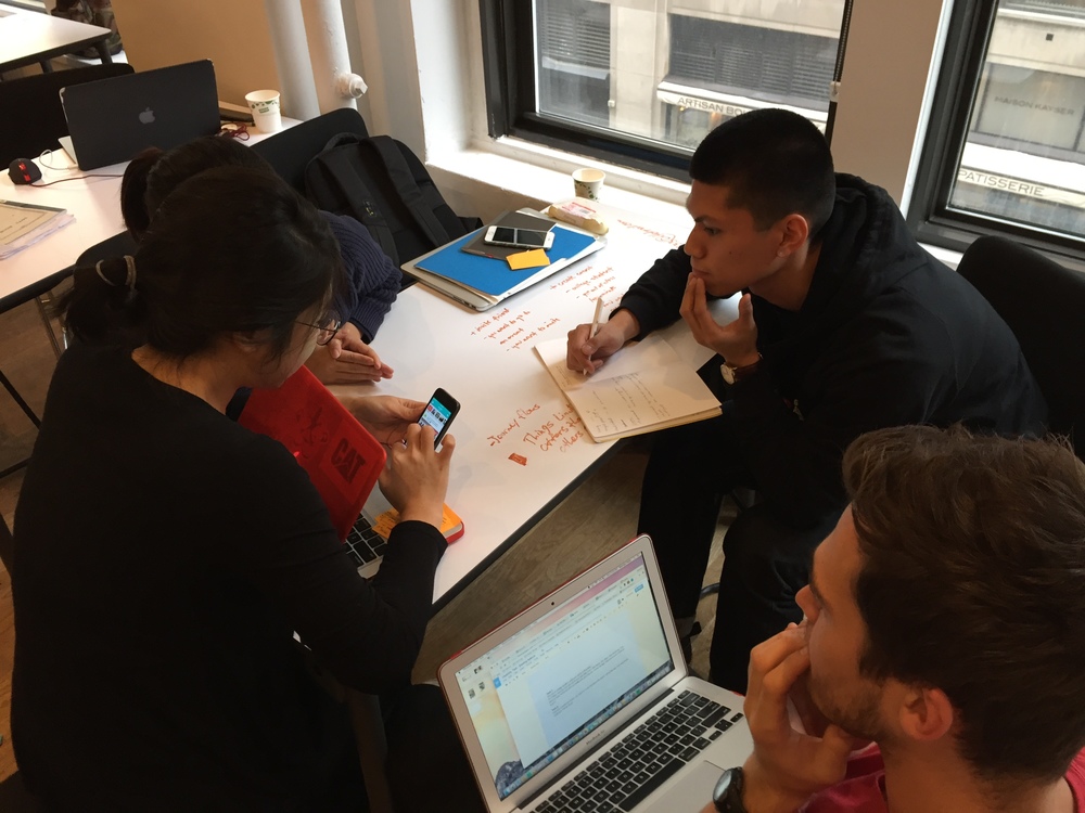
Baseline usability test at Baruch College with Brendan (left), and Ning (not pictured).
Baseline Usability Test
We conducted baseline usability tests to see and figure out what problems users are having with the app’s current state. We found that it was easier and that users preferred to find events rather than creating events.
We made sure to test 3 different tasks:
1. Creating an event
2. Viewing an event
3. Messaging a friend
Takeaways
• Half of the users couldn’t create an event
• They expected to see a list of friends in the Friends tab (it has a confusing empty state)
• Trophy icon was ignored (noo!)
• They didn’t know how to message people
• Inviting people to an event they didn’t create was straightforward (yes!)
Heuristic Analysis
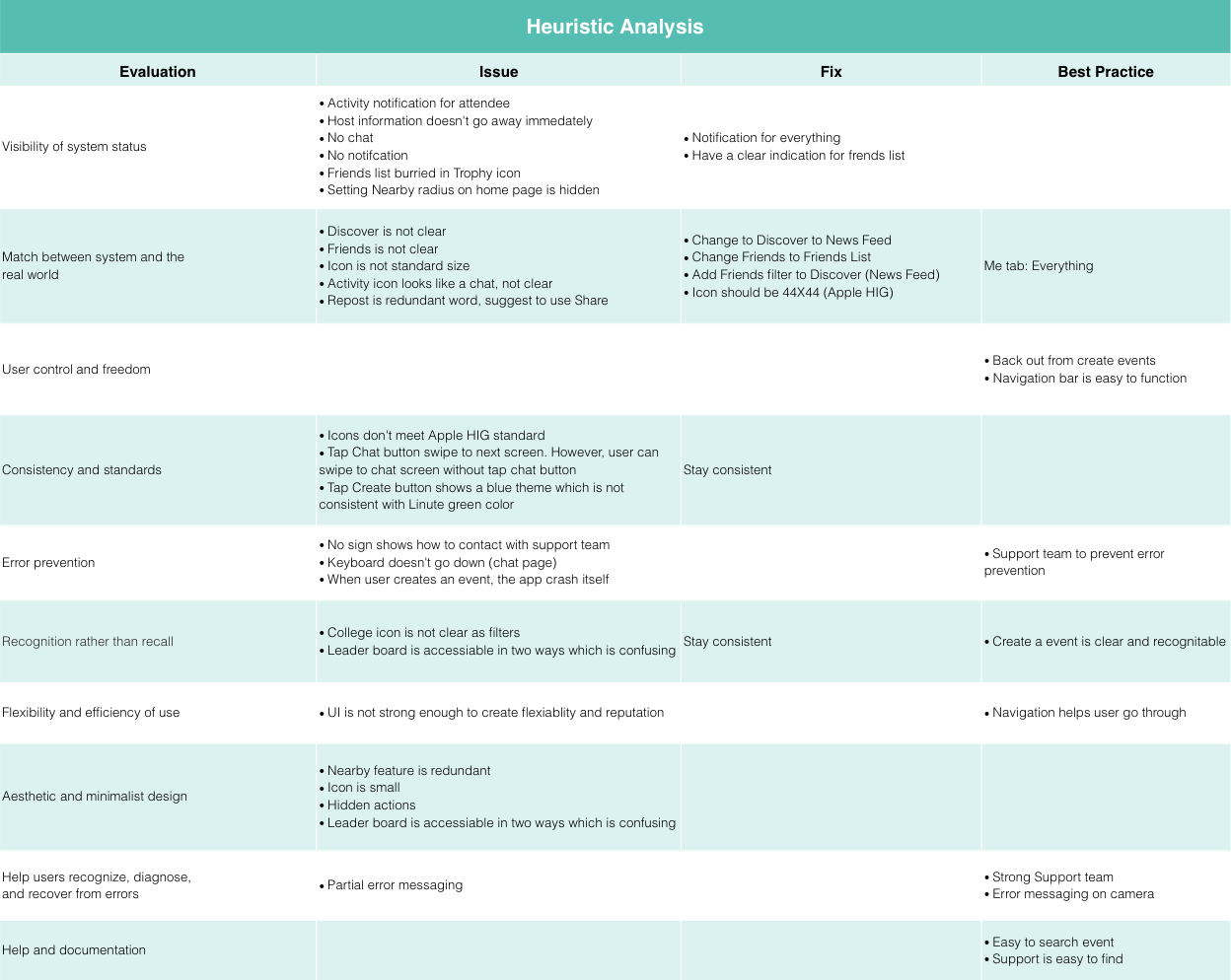
Heuristic analysis of Linute’s app.
We analyzed Linute’s app to determine which areas were done well and areas to improve.
Takeaways
1. Notification system needs improvement.
2. Current Linute categories are confusing to users: they can not tell what belongs in the “Friends” tab or what sets the “Discover” tab apart.
2a. Reposting adds to the confusion as it creates duplicate content in the Friends feed.
3. The process to create an event is confusing to users as they’re not sure what’s required of them in order to properly post content.
3a. Chat was a nice feature, but users were unsure how to access it.
4. Additionally, there is no error messaging to let them know that there is more required data needed from them.
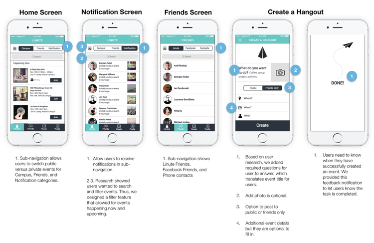
User Flows
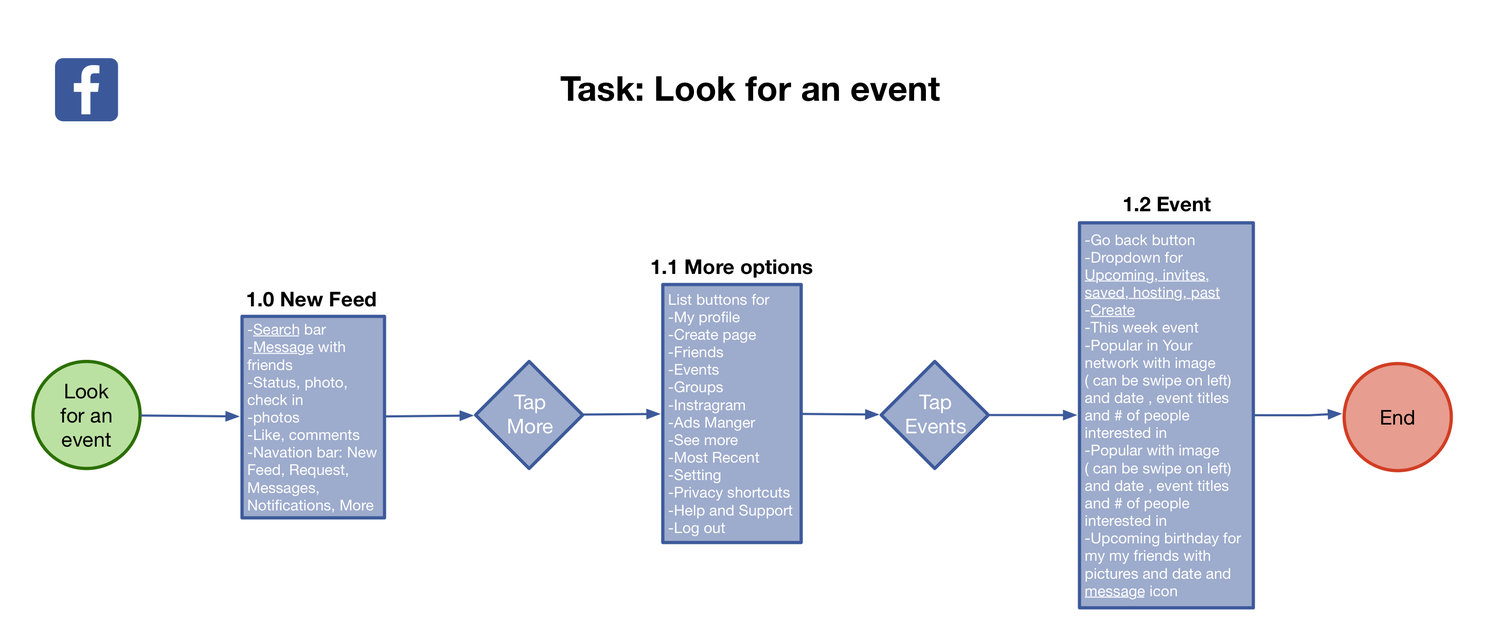
We observed user flows of competing services in comparison to Linute to see how one might look for an event.
There’s a total of five tasks for each of the companies which seems to be the norm. Users can see events as soon as they open the app which is good if it’s what you want your user to do frequently.
We observed user flows of competing services in comparison to Linute to see how one might create an event.
• There are way more tasks that a user needs to go through before being allowed to post an event.
• Inviting friends seems to appear later in the process.
Affinity Mapping
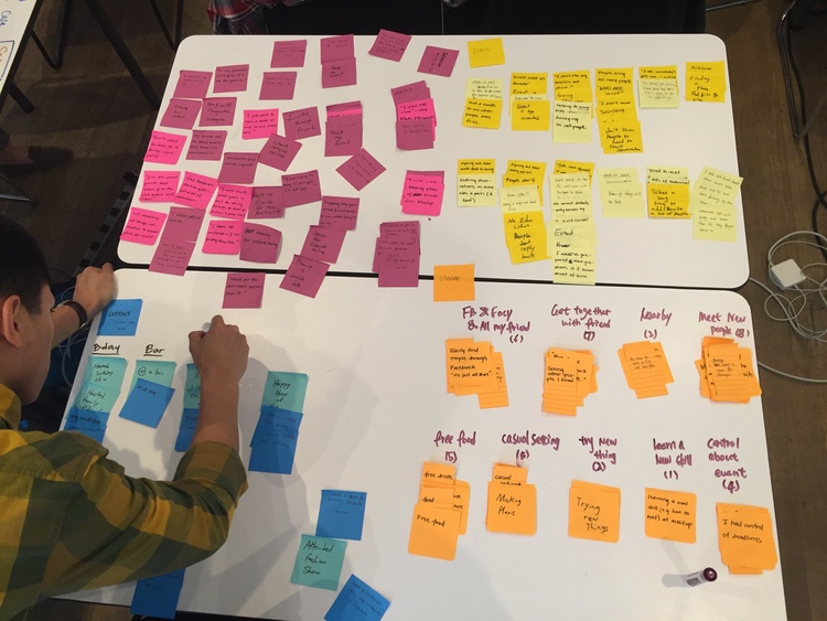
With our initial user research compiled, an affinity map was constructed in order to better analyze the collected data. Materials were categorized based on the 4-list method in which all data is placed into one of four categories labeled Pain, Pleasures, Behavior, and Content. This practice allows us to see any similarities amongst the collective user experience.
We focused on our users’ pains and pleasure and took into consideration their behaviors and context.
Pleasures
• Meet with new people
• Get together with friends
• Easily find friends on Facebook
• Casual setting
Pains
• Need to know event details
• Don’t know people, hard to converse
• Don’t like share personal information
• RSVP but didn’t show up
Personas
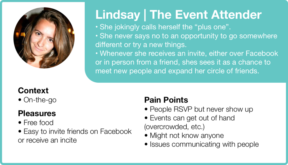
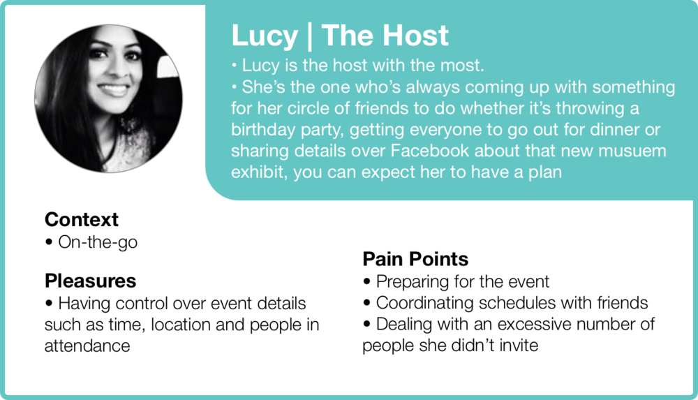
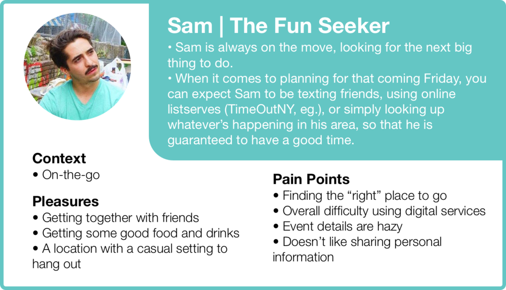
In order to properly address the different types of users who would interact with Linute, personas were generated to stand as representations of different desired actions and goals.
We concluded that there’s three different types of personas that relates to the users:
1. Lindsay, who like to attend events
2. Lucy, who likes to host events
3. Sam, who likes to attend events as well but is a little more specific than Lindsay.
We ended up focusing on the event attenders who don’t necessarily create their own events.
User Journey
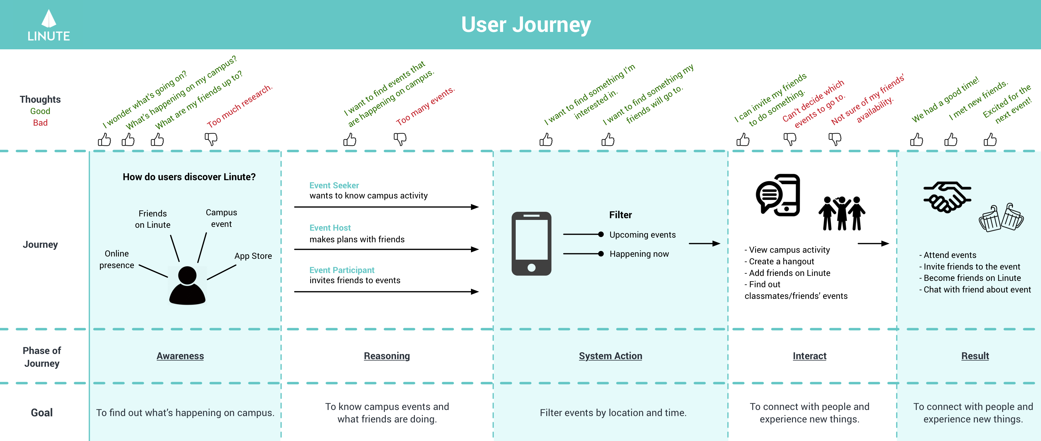
User journey that shows how a typical Linute user interacts with the app.
I created this user journey to visualize how a Linute user, and the interface would interact with one another. It is an effective way of displaying the sequence of the user experience, as well as the “how”.
Design Studio
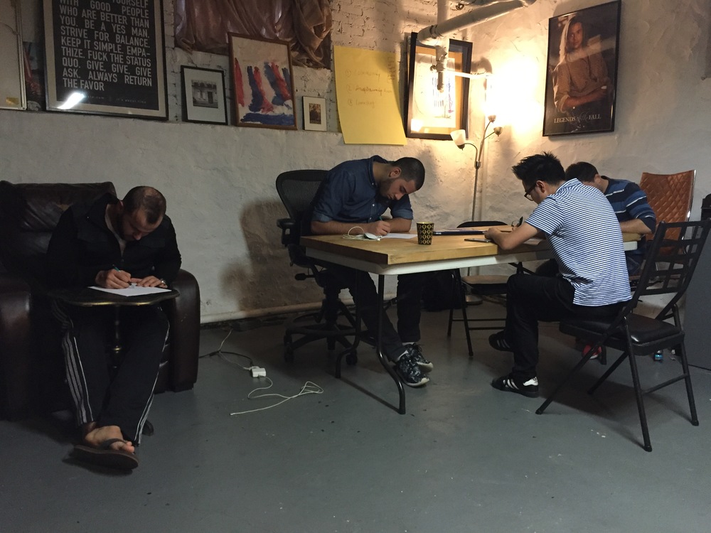
We included our stakeholders in this part of the process to ensure that their ideas were also incorporated into the final designs. We looked at their ideas while conducting our own Design Studio so that the final product was a combined effort from both parties.
Feature Prioritization
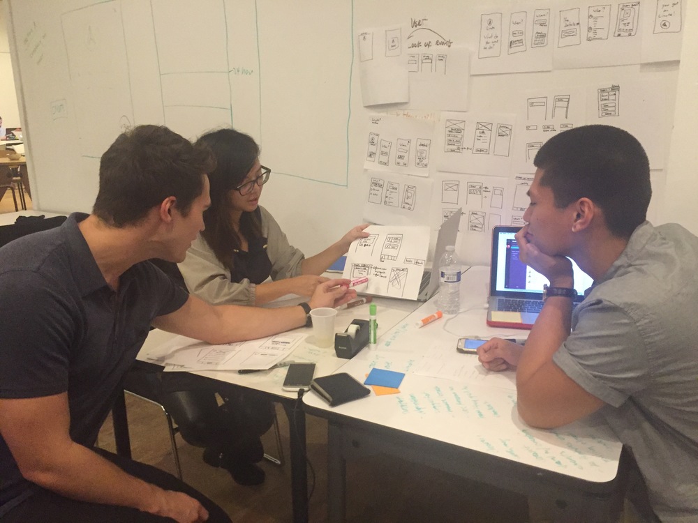
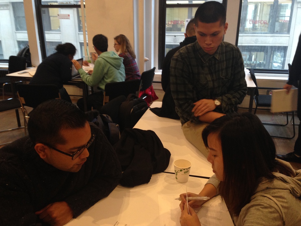
Prioritizing features with Ning and Brendan.
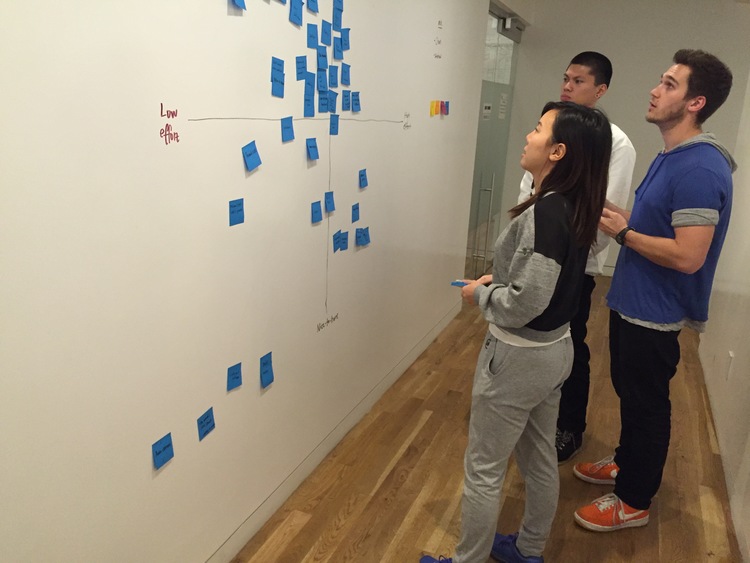
Digitized feature prioritization.
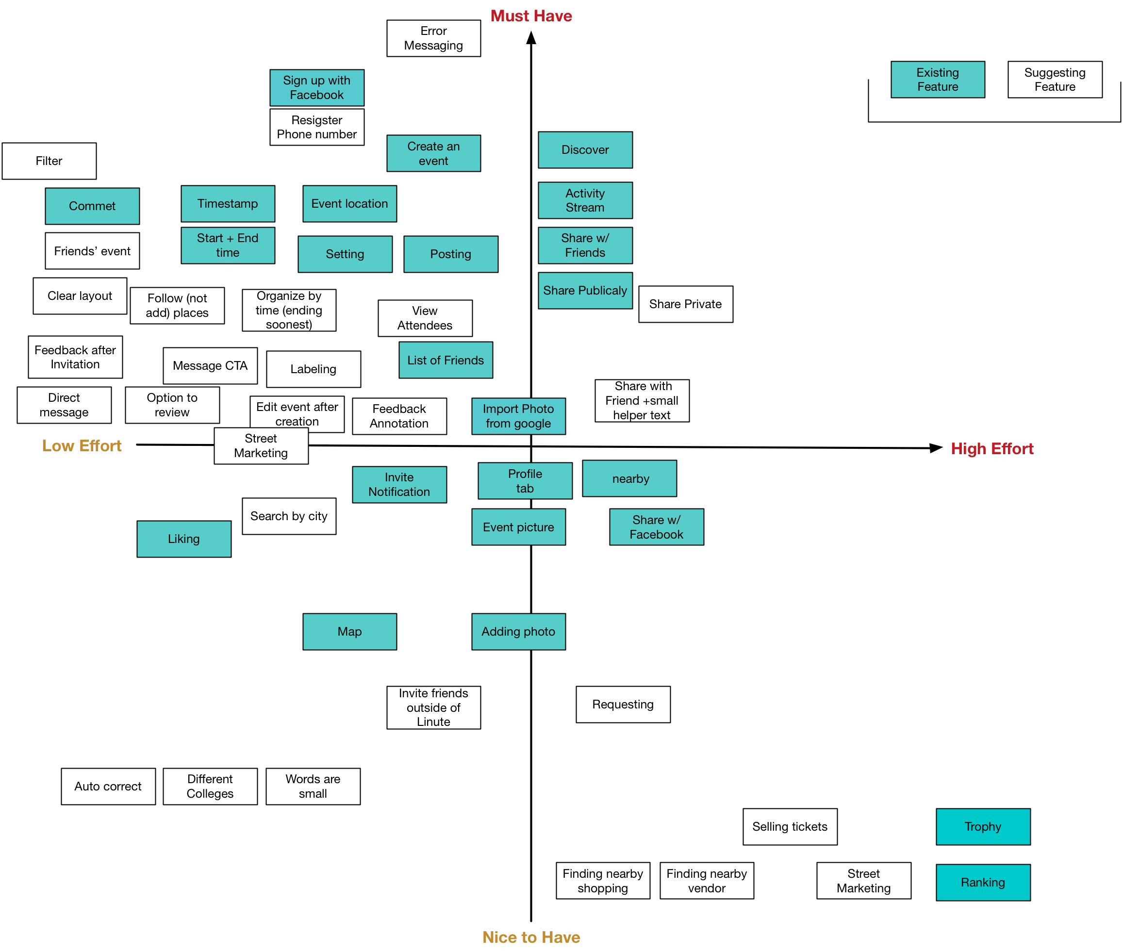
A listing of features for the app, both existing and suggested, are ranked and organized through a graph. The X-axis represents the level of effort to implement, and the Y-axis representing whether the feature is a must have necessity, or a nice to have implementation to come after the priority features.
• Boxes highlighted in teal represent existing features within Linute.
• Boxes highlighted in white represent suggested features based on our user research and data.
• The outlined quadrant are features that are considered low effort to implement, and a must have in terms of necessity. These features are the ones that our data suggests must be included in any version of Linute going forward.
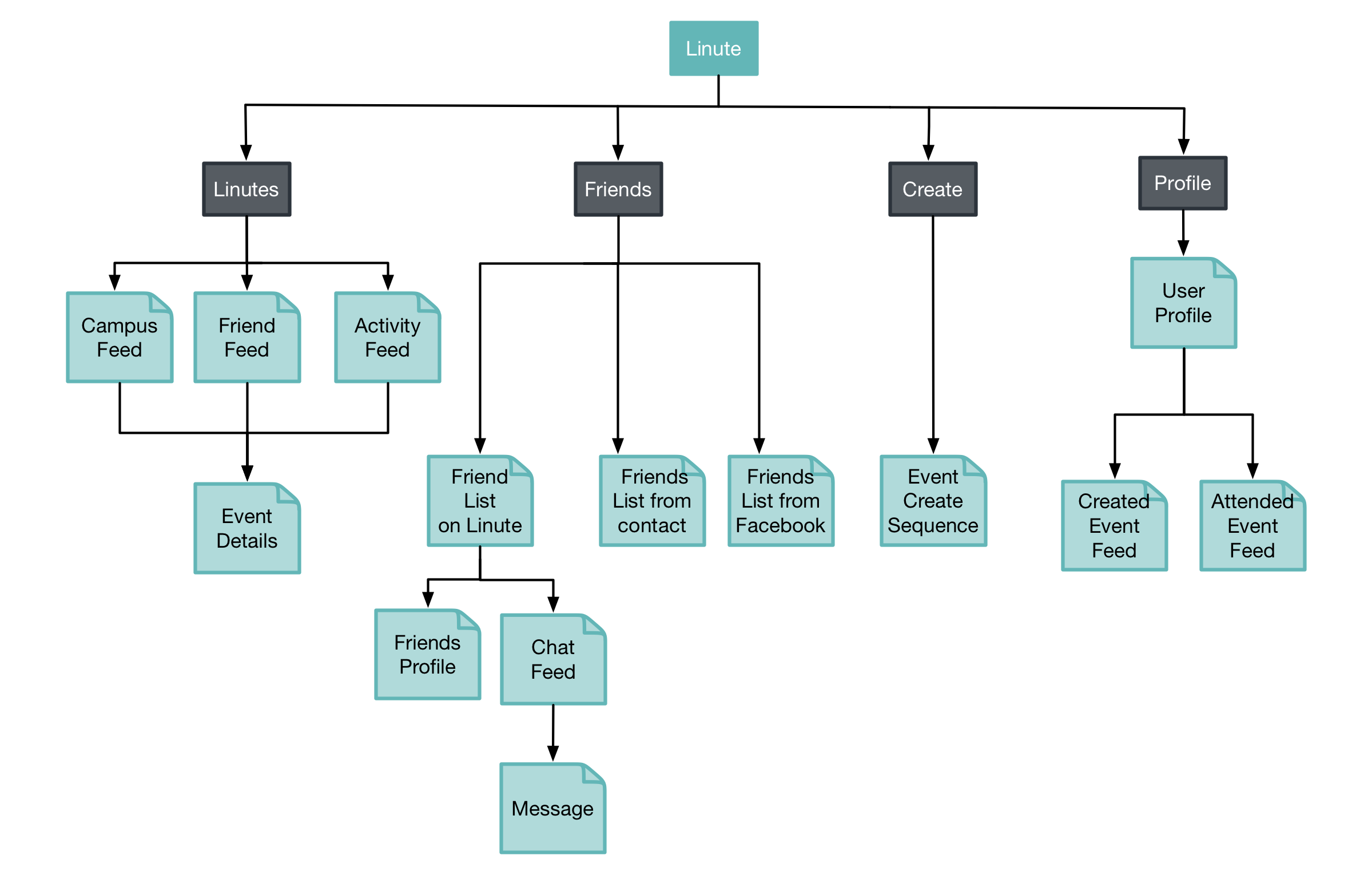
App Map
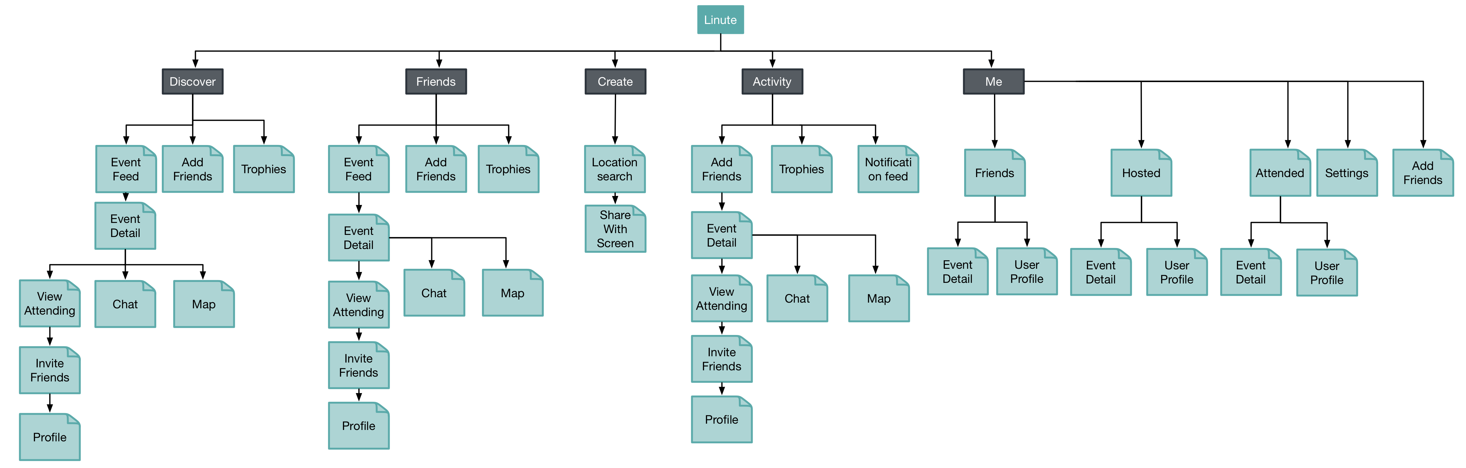
Before
After
Above is a look at Linute’s app map aka list of screens accessible from the Home Screen and the different tabs. As you can see, there a few redundancies - screens accessible in more than one place therefore creating confusion and inconsistency.
After we’ve conducted rounds of Design Studio both at our stakeholders headquarters and within our own team, we were able to get rid of unnecessary screens and simplify the app layout. Below is a look at our proposed redesign.
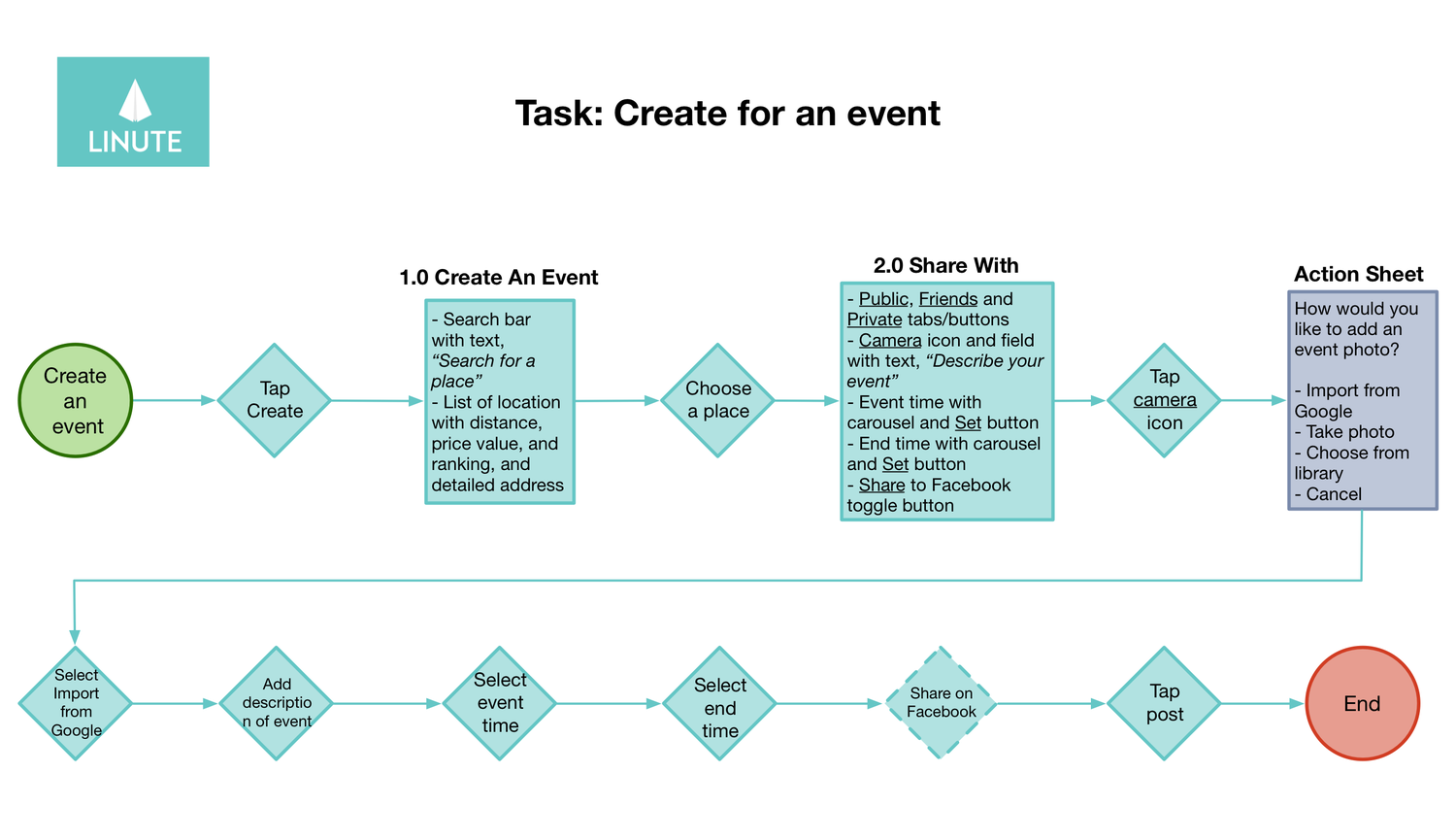
Swim Lanes
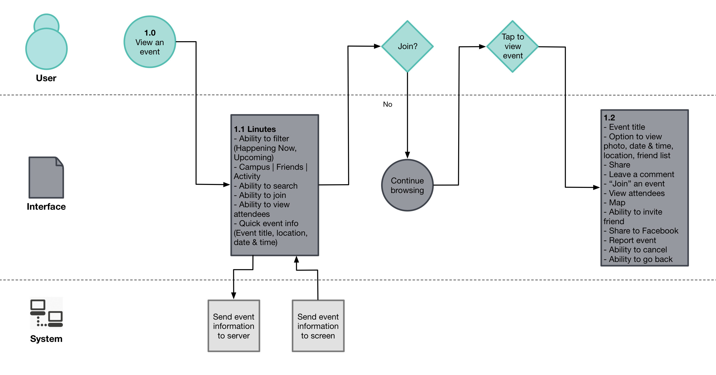
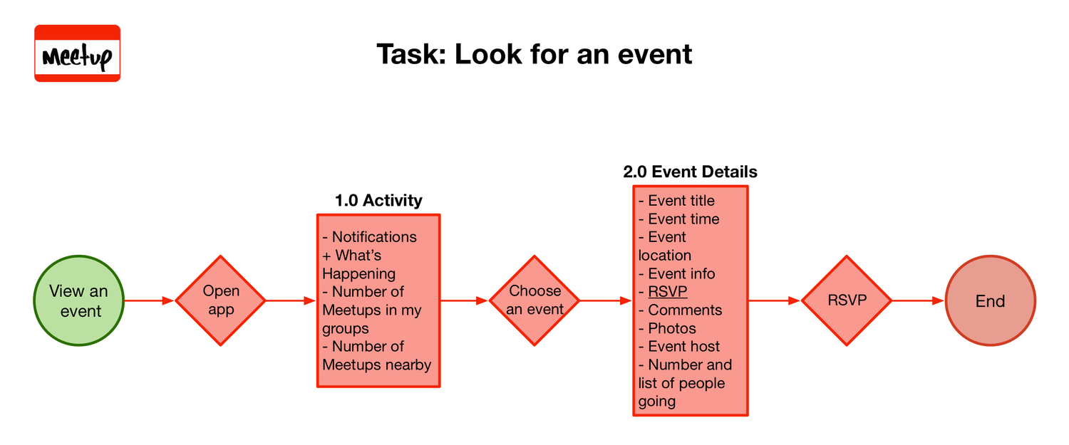
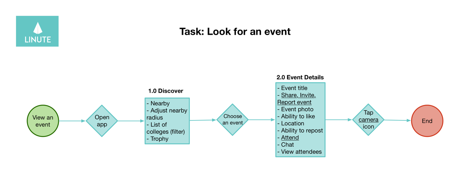
Swim lane for viewing an event.
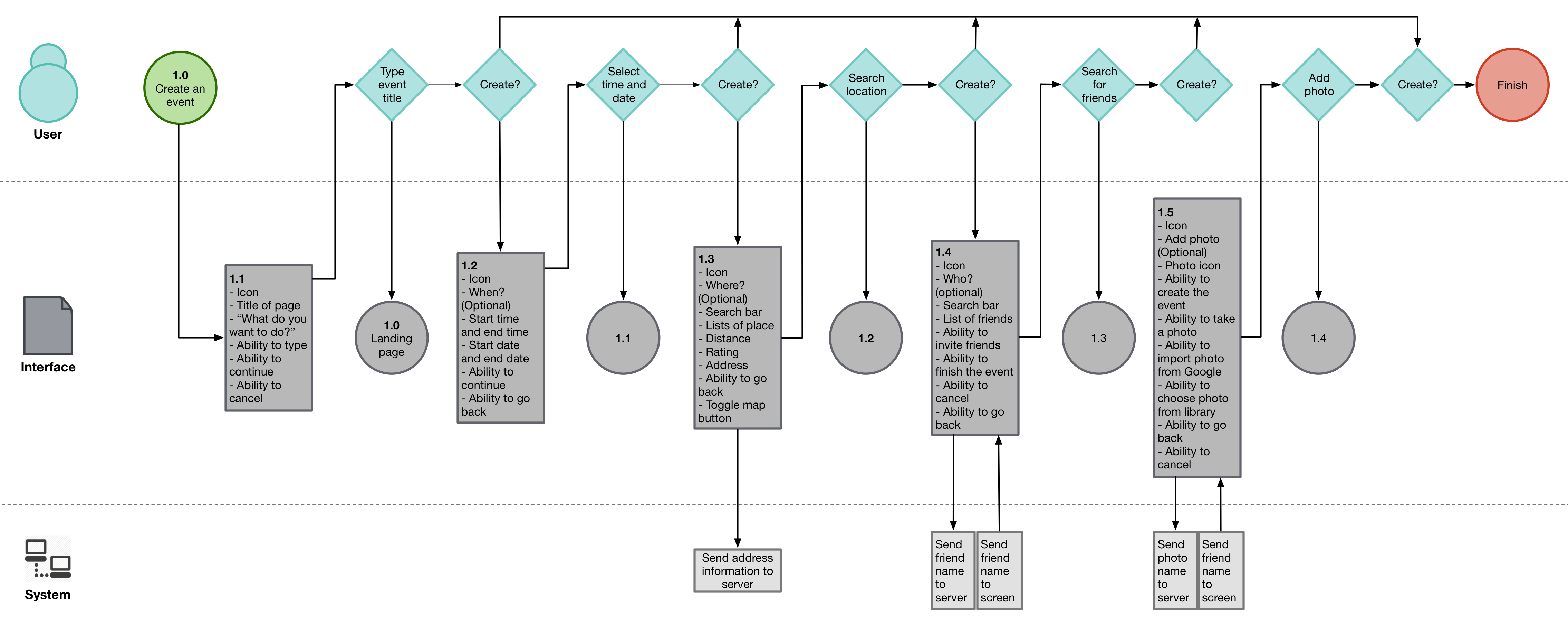
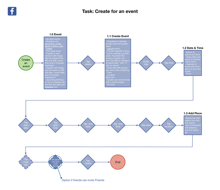
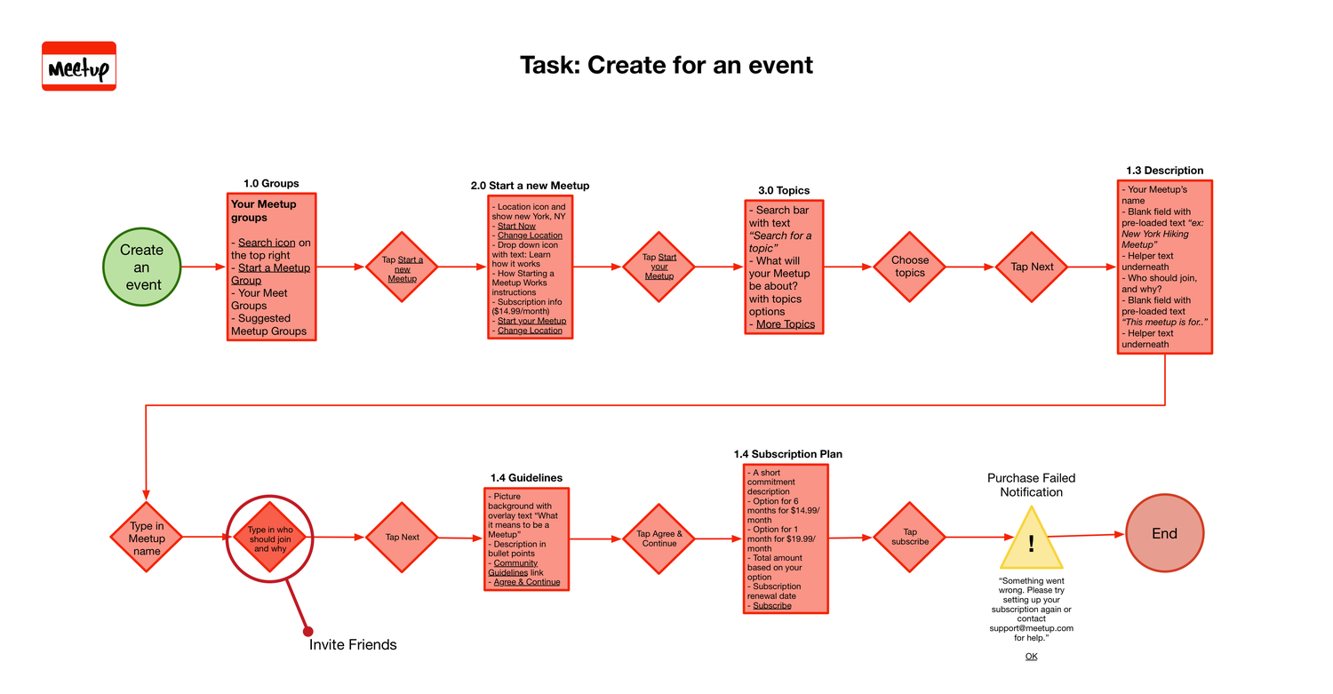
Swim lane for creating an event.
Above is the communication between user, interface (device) and system when looking for an event and below is when you’re creating an event. The swim lane flows allows us to visualize, and separate roles and actions within the task flow of a users interaction with Linute. This is also extremely helpful when communicating our designs to the developer.
High-Fidelity Mockups
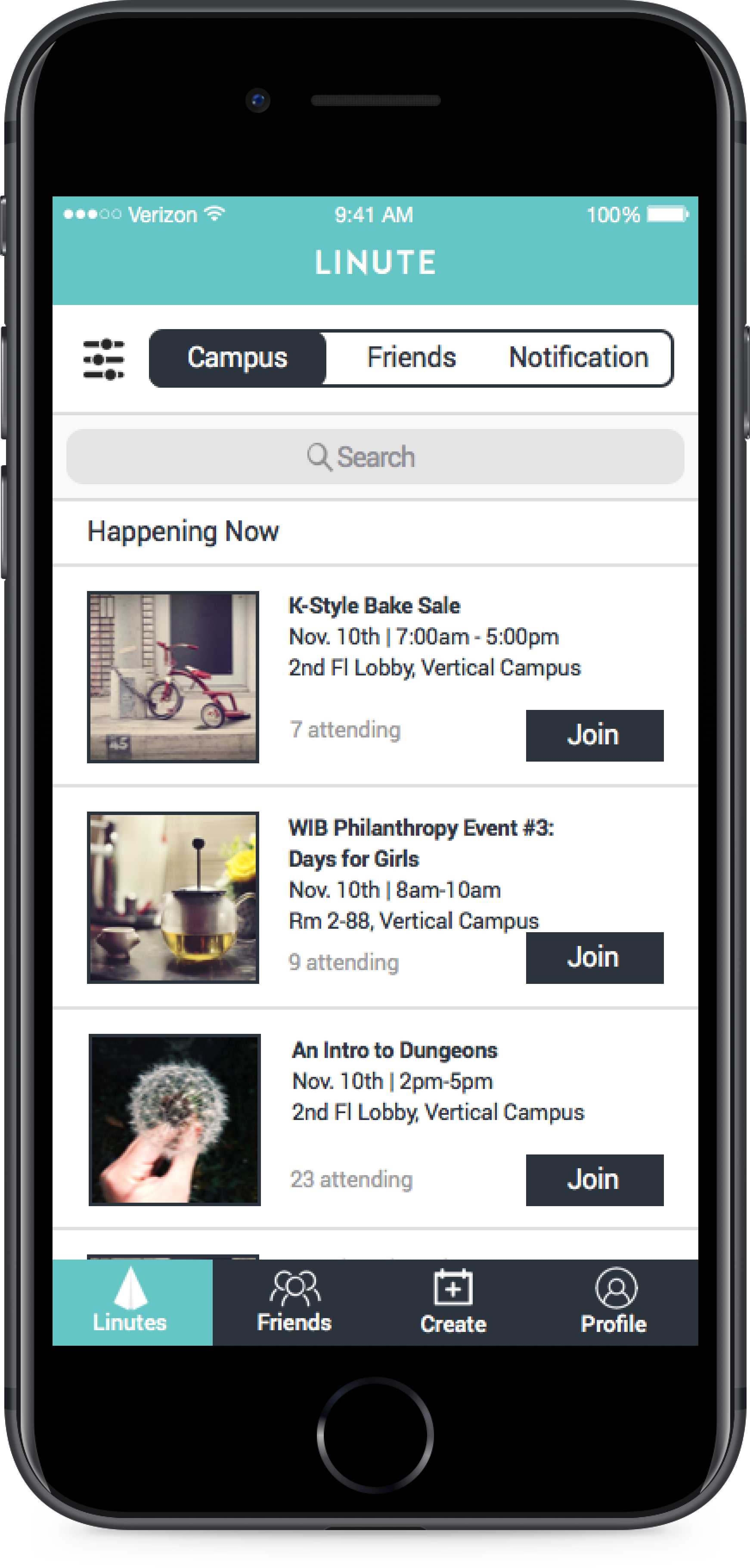
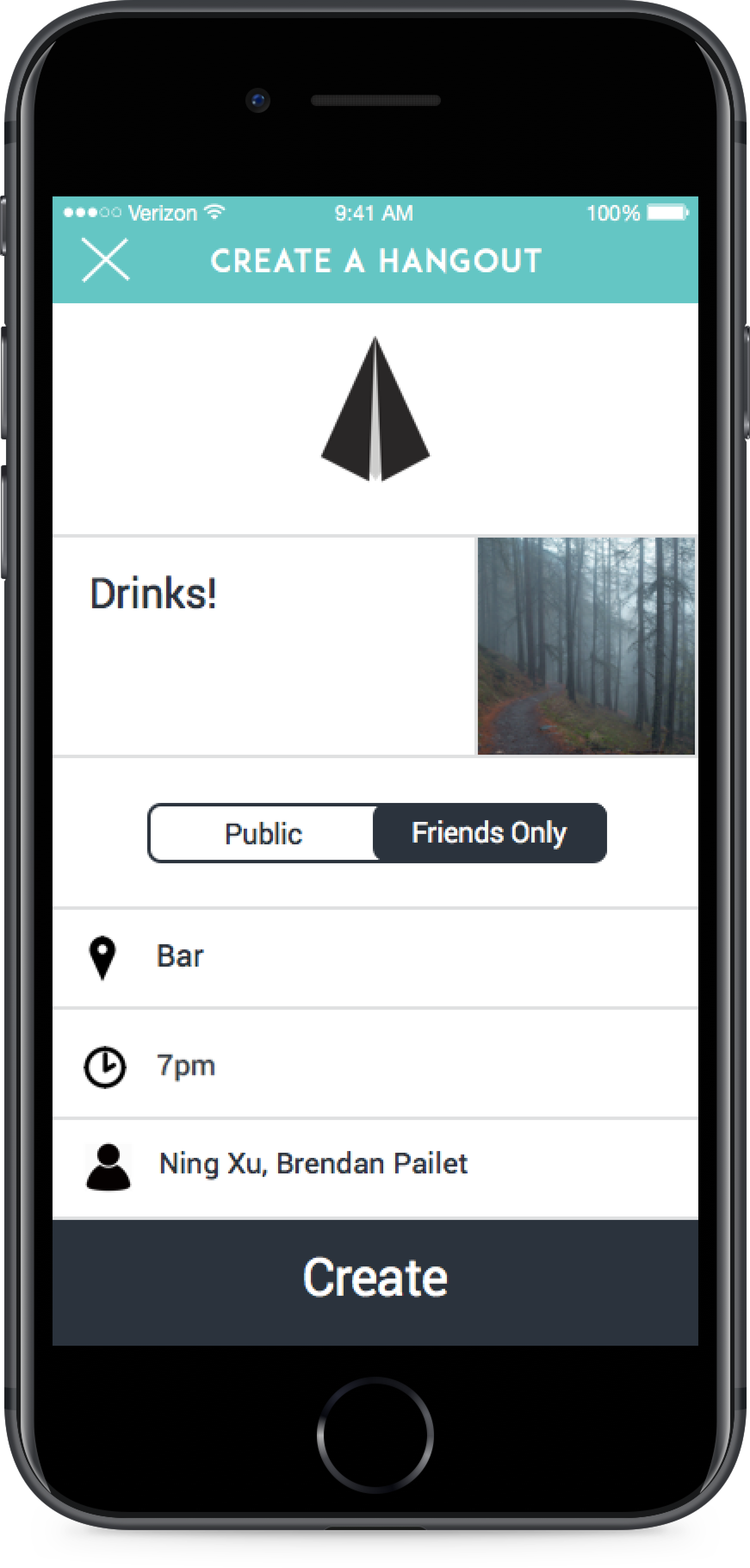
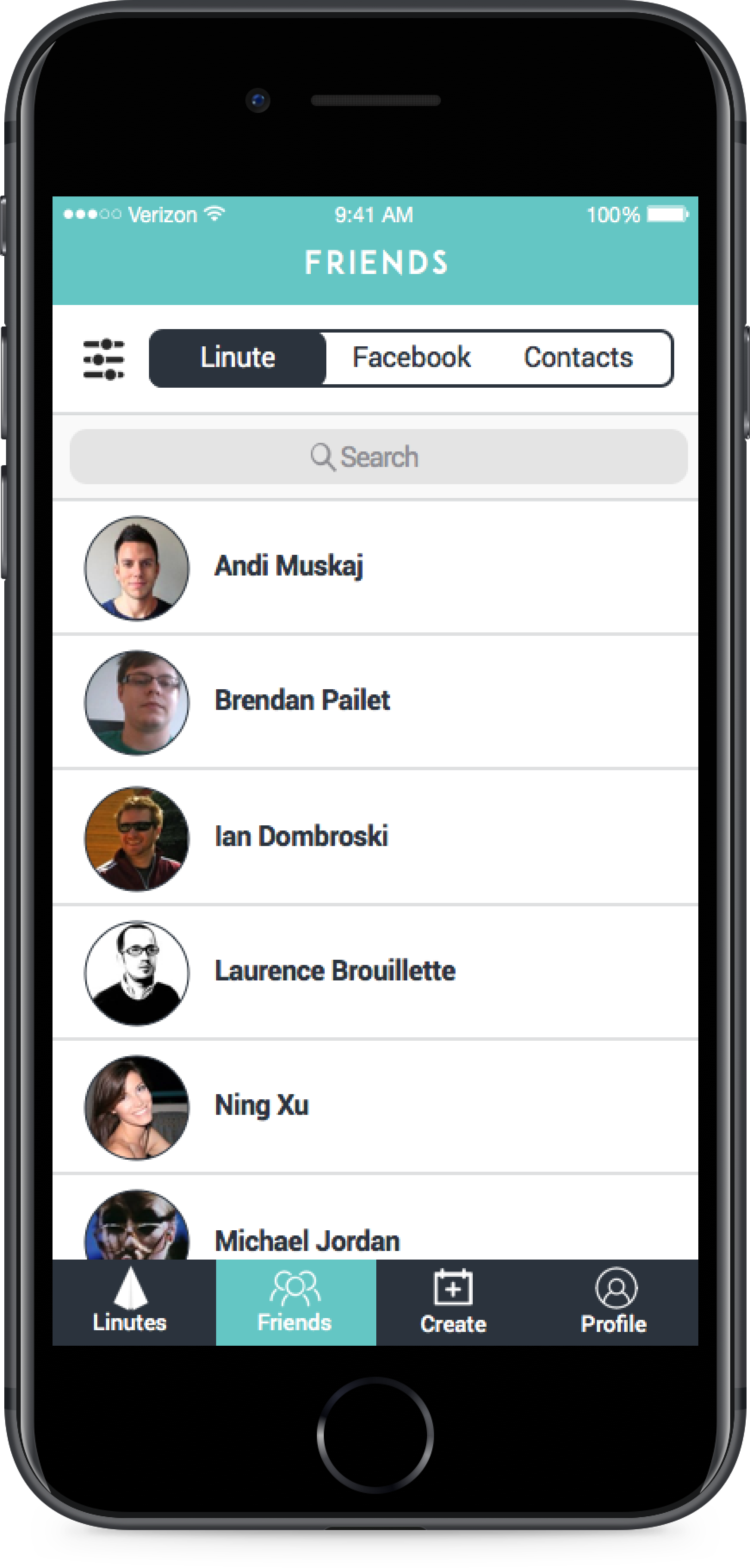
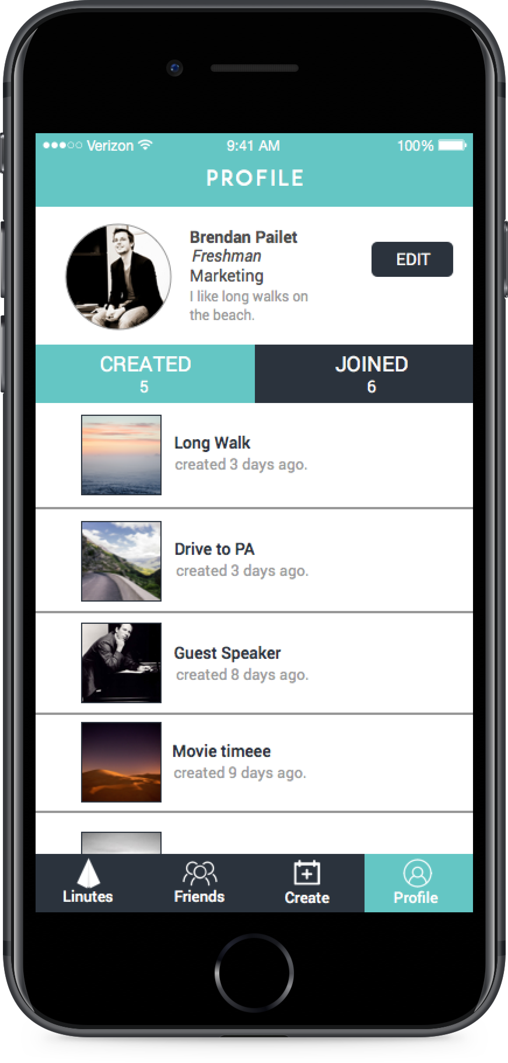
Above are high fidelity mockups of our designs as a result from our Design Studio. Without redesigning too much of Linute’s current look, we were able to incorporate information we gathered from our research.
Annotated Mockups
Usability Testing
We tested the same tasks from our baseline usability testing for our design proposals for consistency:
1. Creating an event
2. Viewing an event
3. Messaging a friend
New Takeaways
• Users are now able to distinguish between events from different feed sources through the filter button
• Users were also able to see all notifications from the top nav as well
• Users are now able to see a list of friends through the Friends tab below
• Users are able to create and post events in a matter of seconds
• We made sure that this aspect of the app was as simple as scrolling to discover events. The only information required is the event name and the rest is optional which is essential for the type of users Linute is targeting.
Outcome
Click here to see the prototype
We gave a Keynote presentation to our client followed by a debrief meeting where we discussed questions and design decisions in detail which were backed by findings summarized in the research report.
Our research in particular was extremely helpful in providing insight into the behavior, motivation and goals of their users. Linute has since evolved into a social media app called Tapt that’s made exclusively for students to share their campus life in an intimate environment.
Testimonials

“I had a wonderful time working with Ebenezer. He is super disciplined and a blast to work with. He was in charge of taking our product and dissecting it. He has found some significant flaw in our product. To top that off, he, and his team were ready with solutions on how we can fix it. Ebenezer would be a wonderful addition for any company with side affects that include great energy and hustle.”
- Nabeel Alamgir, CEO & Co-Founder of Linute

“Ebenezer was one of the superstars that helped us tackle user experience here at Linute. Ebby, as we like to call him, with his firm and pleasant demeanor, has a great way of explaining anything. He also did some amazing work leading the user journey section of the report, on top of the personas, affinity map, etc. He’s an awesome guy to work with, and will add great value to any organization that he wishes to join.”
- Andi Muskaj, COO & Co-Founder of Linute
Featured Work

Teladoc Health2022 - present

BlockFiApr 2021 - Dec 2021

JPMorgan Chase & Co.2020 - 2021
TD Ameritrade2017 - 2020
Goodfoot2016